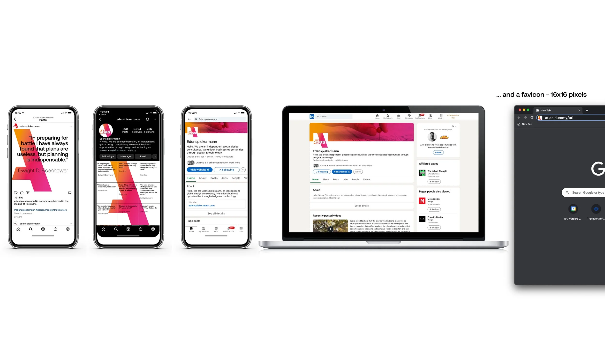
When Atlas launched into the subscription consultancy market, they needed a big impact look: the antithesis of the usual understated B2B branding. They required a bright, optimistic, characterful visual identity to reflect their brand truth – years of expertise gained from launching and running big, exciting publishing products.
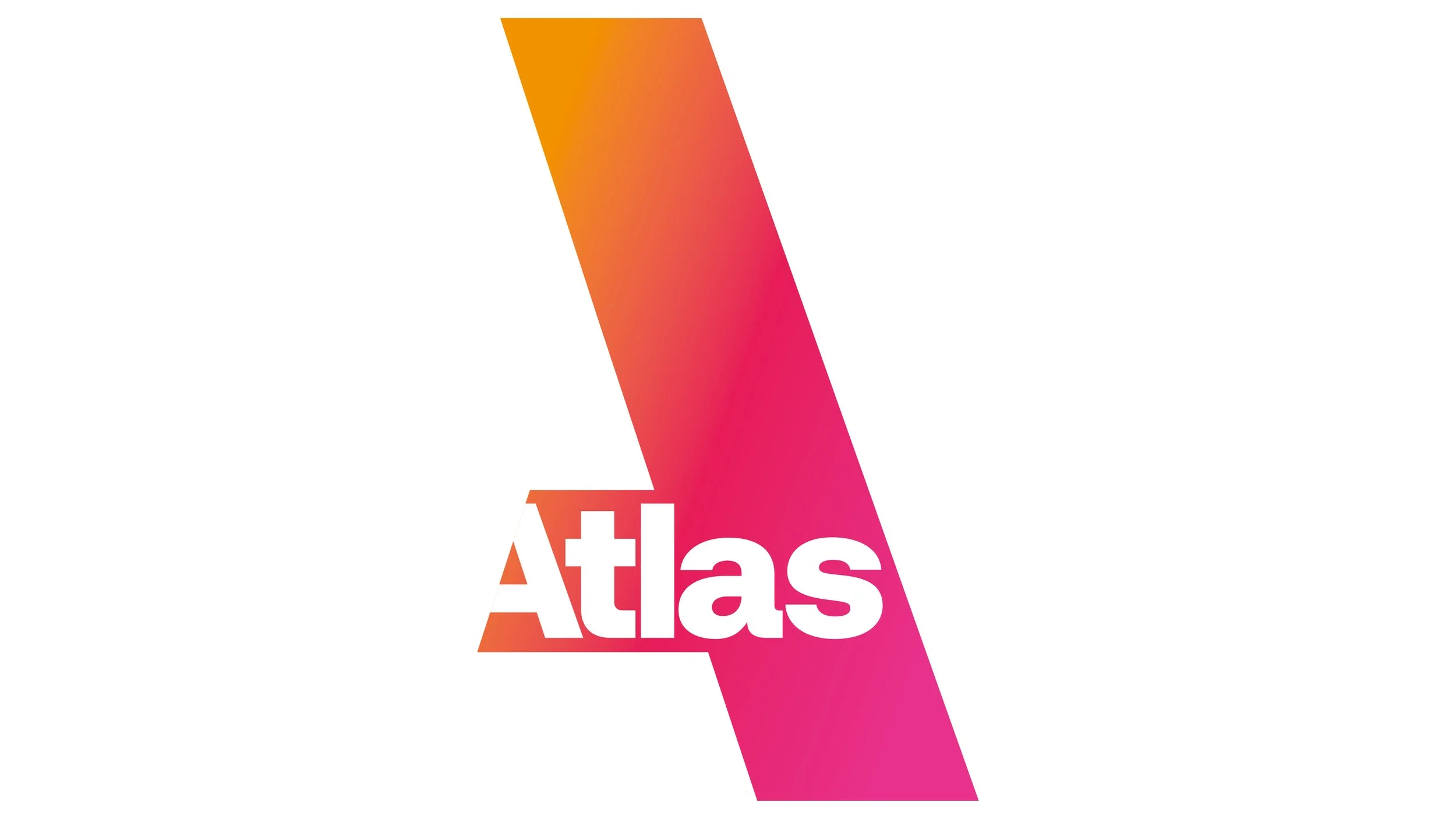
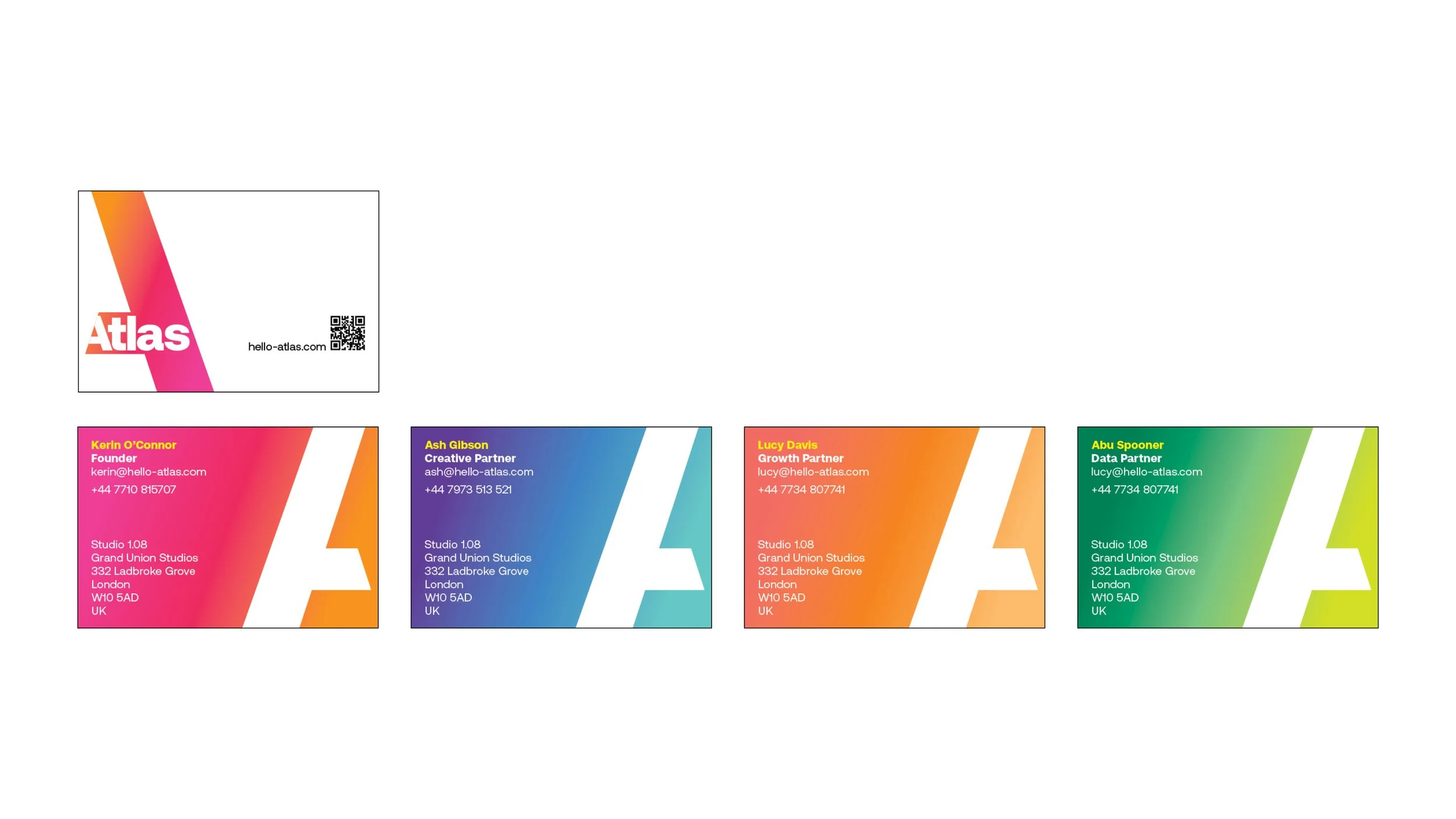
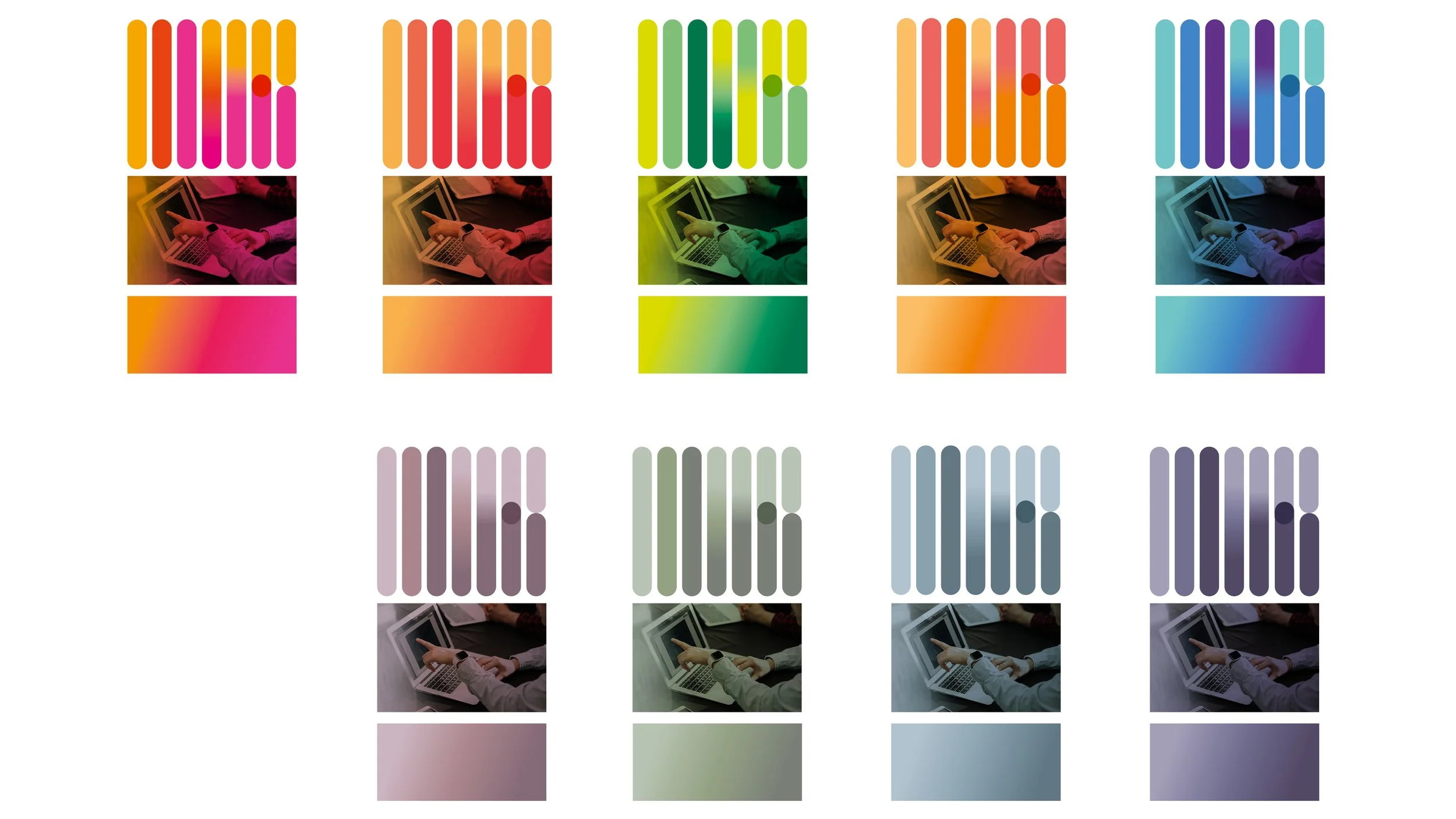
The deconstructed A is visually disruptive, while the optical trick of allowing the viewer to complete the letter represents what Atlas do – mapping a clear path for their clients, and guiding them into unknown territories.
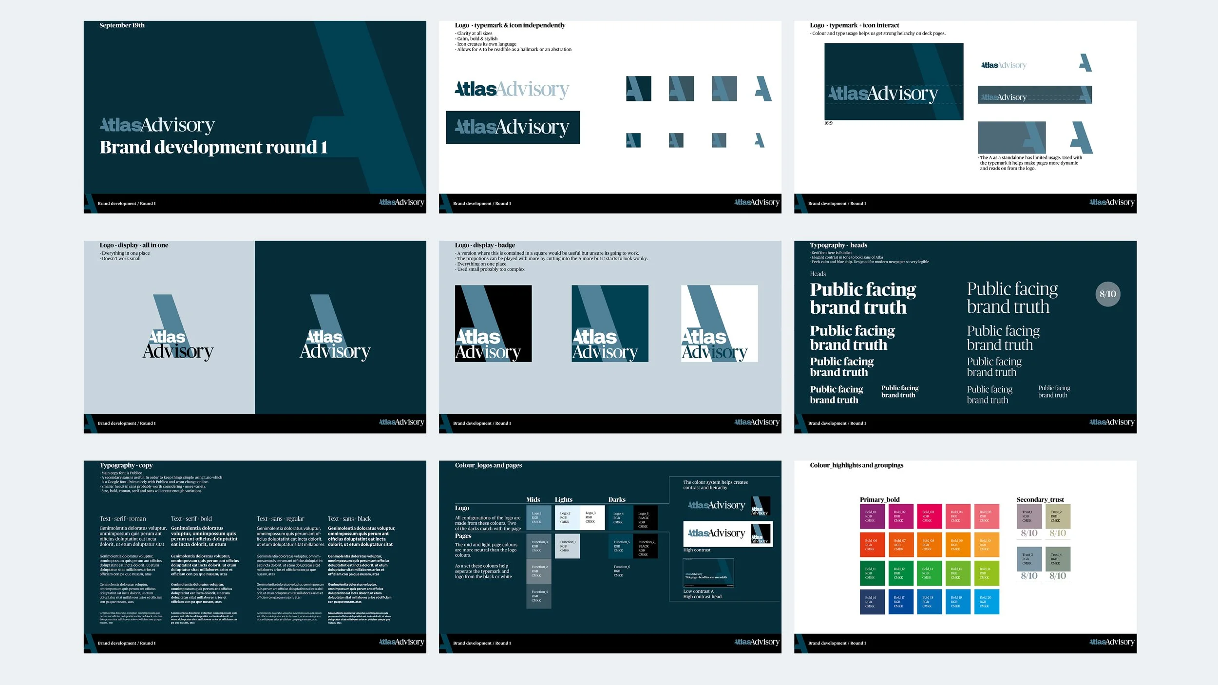
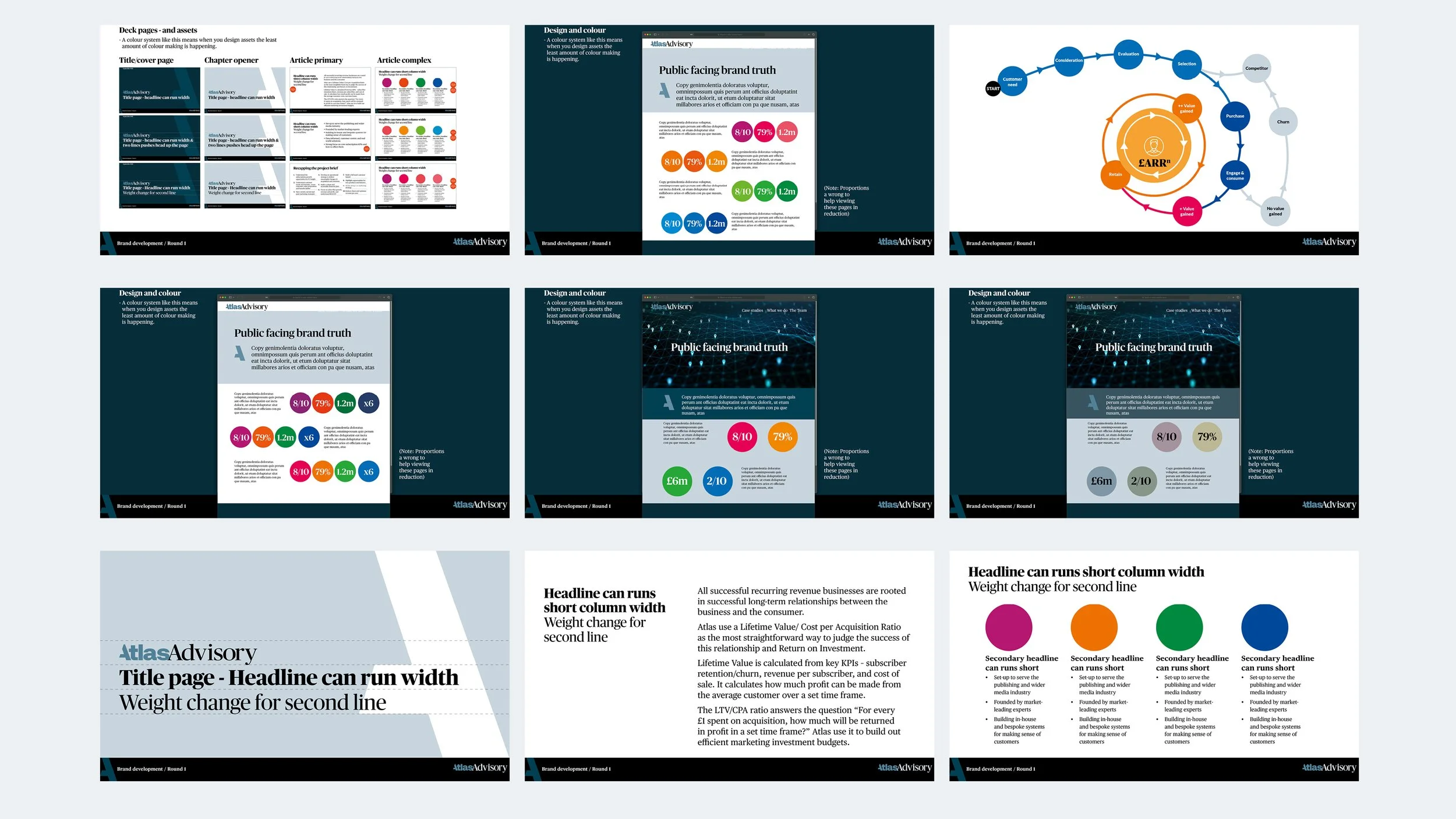
The company is expanding fast, launching sister companies that move their skills into other sectors. The first was Atlas Advisory, aimed at the VC world. It needed a more austere, “modern boardroom” look and feel. Explaining their process required a more graphically demanding information design, employing a rich colour system that sits under the primary brand architecture.